

It is no mystery that for nonprofits, securing funding remains the lifeblood of their operations.
What’s usually underestimated is the time dedicated by management teams to fundraising only, which we’ve seen reach upwards 90% of total time for Executive Directors, while rarely dropping below 50%. This is precious time taken away from strategic planning and program growth. There’s a real need to equip nonprofit execs with better fundraising tools.
What’s wrong with existing tools?

Pretty much everything if we’re being honest. In today’s digital age, where our attention is a scarce and highly valued resource, nonprofits face a pressing challenge: annual PDF reports, webinar plenaries, and under-optimized newsletters struggle to capture the attention of modern audiences amidst a crowded media landscape. To thrive, organizations must embrace new and engaging forms of communication that resonate with diverse stakeholders.
So out with the static expensive reports with outdated impact stats. Donors want engagement, stories, emotion. Maps and place-based communications offer an alternative.
🗺️Maps: The Perfect Communication Tool
The public’s enthusiasm for maps is undeniable.
Maps offer a unique and powerful way to convey complex information. If a picture is worth a thousand words, then a map is worth a thousand pictures. But the true potential of cartography goes beyond static visuals. Interactive maps, dynamic storytelling, and maps embedded within narratives can inspire deeper engagement and create meaningful connections with new audiences.
Maps are not only eye-candy, they also are powerful tools for activism.
Ruth Gilmore, a renowned critical cartographer who has deeply inspired our work, eloquently states, “A geographical imperative lies at the heart of every struggle for social justice; if justice is embodied, it is then therefore always spatial, which is to say, part of a process of making a place.” As a matter of fact, geography plays a critical role in activism and social change. We’ve written more extensively about this in our article “Maps that move the needle”, where we explore the destructive and transformative power of map-making.
By leveraging the power of GIS (Geographic Information Systems), nonprofits can not only captivate their stakeholders but also advance their cause.

Barriers to GIS Adoption in Nonprofits
Despite their promise, GIS solutions remain underutilized in the nonprofit sector, primarily due to several persistent barriers:
Perceived high costs: nonprofits believe GIS tools are prohibitively expensive. While this perception doesn’t always reflect reality, it remains a significant hurdle.
Scarcity of talent: skilled GIS professionals are in high demand across industries, leaving nonprofits struggling to attract and retain this expertise.
Data challenges: many organizations lack structured archives, robust data collection protocols, and effective data governance. This leads to poorly contextualized data points, and over-reliance on outdated figures to show need and impact.
Traditional mindsets: nonprofits often cling to established communication methods, such as annual reports, citing donor expectations as justification: “We’ve always done it this way.”
Overcoming these challenges requires a fresh approach—one that combines the strengths of GIS technology with innovative communication strategies. It also requires a bit of a paradigm shift: GIS doesn’t have to be complex, nor expensive (insert link to Mazi). This is at the heart of our mission at North Arrow, and we’ve proven it times and over.
The Interactive Impact Report: A transformative solution
The growing GIS industry and data-driven social impact companies like ours are helping to bridge that gap. The former by developing accessible mapping products and the latter by creating map-based tools for nonprofits and helping them foster a stronger data-driven culture. We’re particularly fond of ESRI’s Storymaps to build highly engaging interactive impact reports. The results we’ve seen over the past two years speak for themselves:
45% increase in donations: Interactive Impact Tours perform much better than traditional websites to drive donations.
75% increase in engagement time: maps keep people engaged! Less than 10% of your potential donors will reach the end of a pdf report, while this share quadruples with interactive experiences.
600-8000% return on investment: in looking at donations and grants that have been immediately motivated by interactive impact tours, we’ve always delivered projects that did much more than pay for themselves. On the upper hand of that range, the simple Annual Appeal we built for Partnership with Children.
💡Below, see the difference between Phipps Neighborhoods 2023 Traditional Annual Report (a great report compared to industry standards!) and the organization's 2024 Interactive Map-Based Impact Tour. Open both in a full page for an immersive experience!

Beyond fundraising: spatial storytelling offers broader benefits for nonprofits
And there’s more! Interactive map-based reports offer much more than fundraising advantages. They provide nonprofits with a versatile tool that addresses a range of organizational needs:
Cost control: By streamlining communication efforts and reducing reliance on traditional mediums, nonprofits can significantly reduce costs. A static report that will be started over each year is 100 hours of work every year. An interactive report is 100 hours the first year, and 10 hours every consecutive year.
Better use of public data: public data, very often underutilized, can be contextualized and visualized effectively through GIS. This eliminates the reliance on isolated data points that lack impact.
Modular communication: reports can be easily customized for specific audiences or regions, allowing for greater relevance and personalization.
Asset reusability and integration: GIS-based tools seamlessly integrate into existing digital ecosystems, including websites, social media platforms, grant proposals, and board reports. This ensures maximum utility and longevity for communication assets.

Real-World Applications of GIS in Nonprofit Storytelling
To illustrate the potential of GIS, here are some examples of how nonprofits can leverage cartography (see examples below)
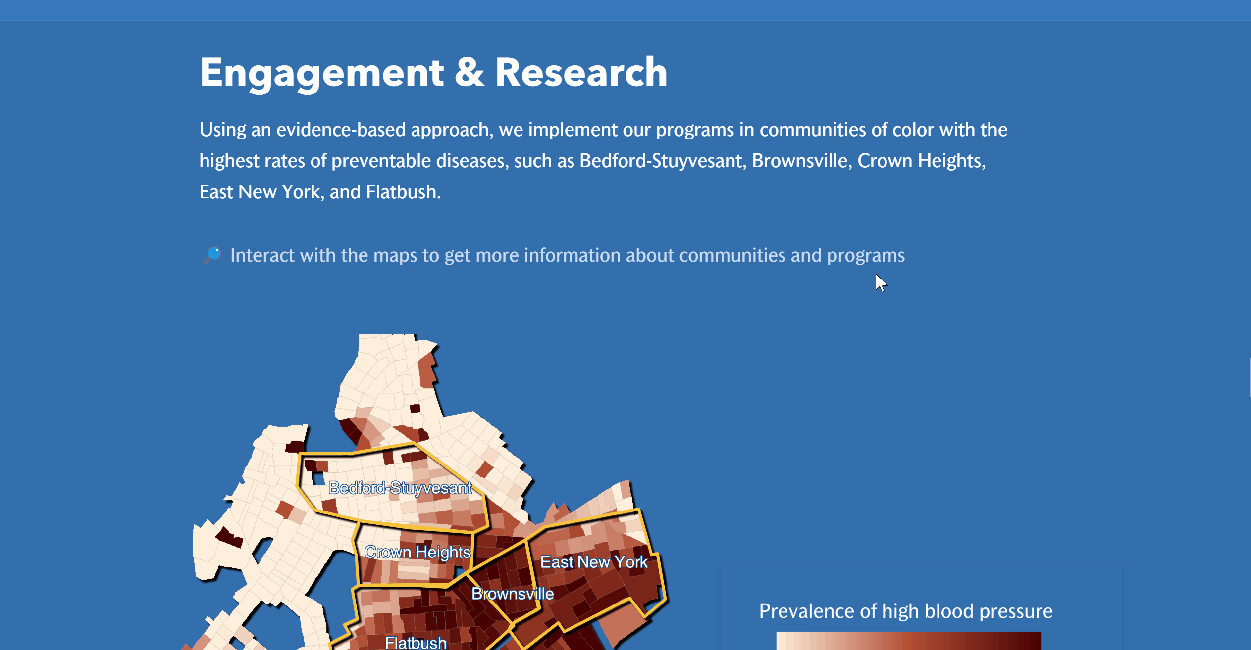
Situation maps: highlighting geographic areas of focus and the challenges they face, while overlaying programs to show relevance of programming. See an example with the Arthur Ashe Institute of Urban Health.
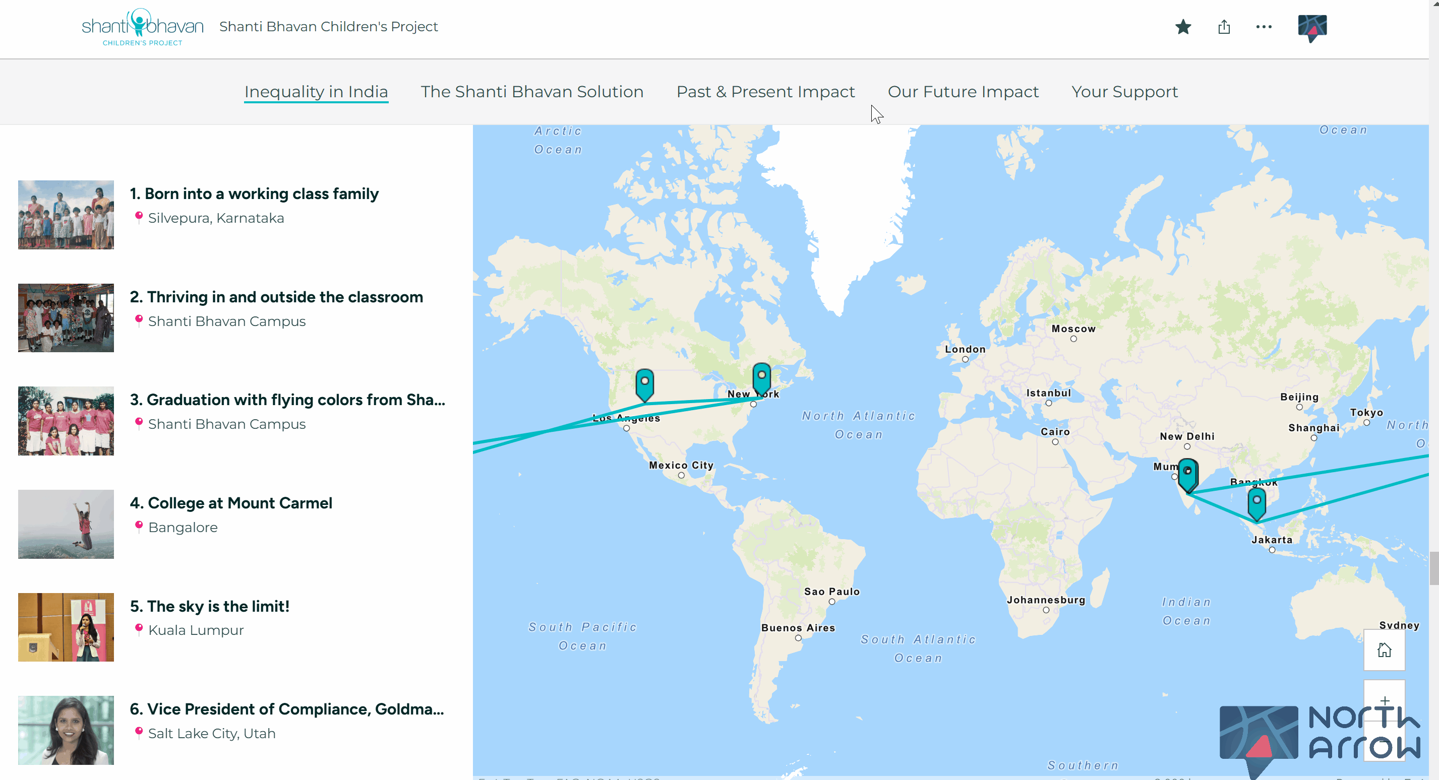
Individual journey maps: showcasing personal stories through interactive narratives. See an example with the Shanti Bhavan Children’s Project.
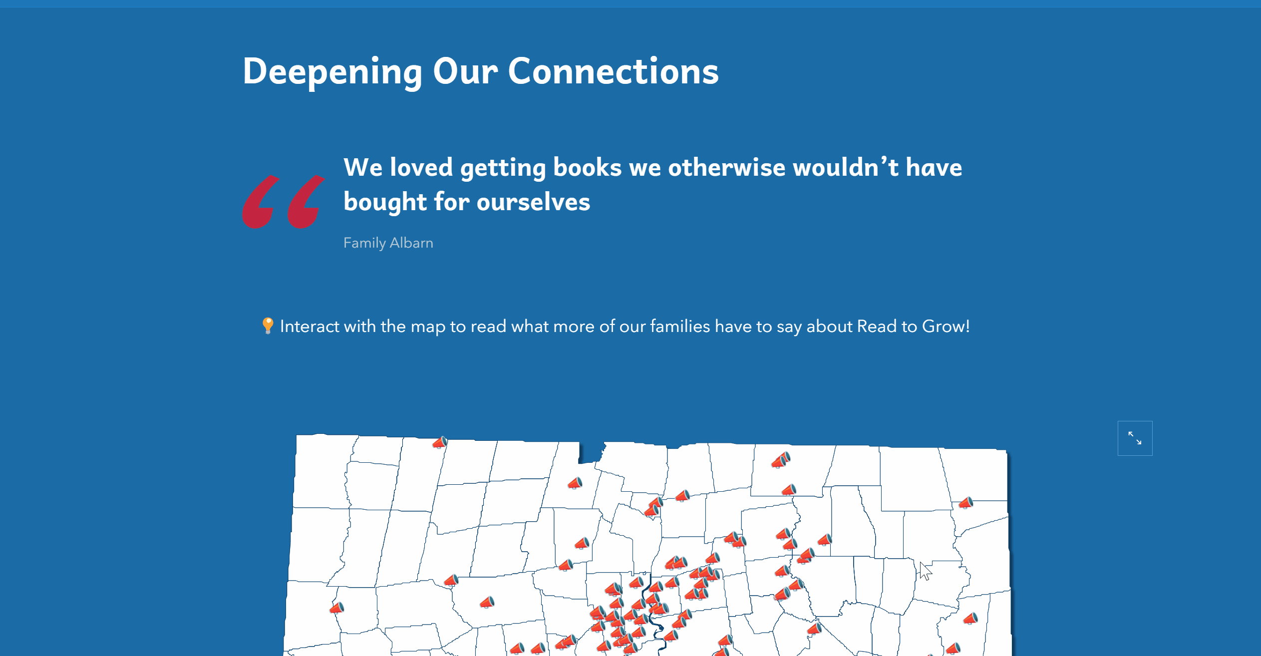
Real-time testimonial maps: collecting and visualizing live testimonials from beneficiaries or stakeholders via surveys. See an example with Read to Grow’s testimonial map.
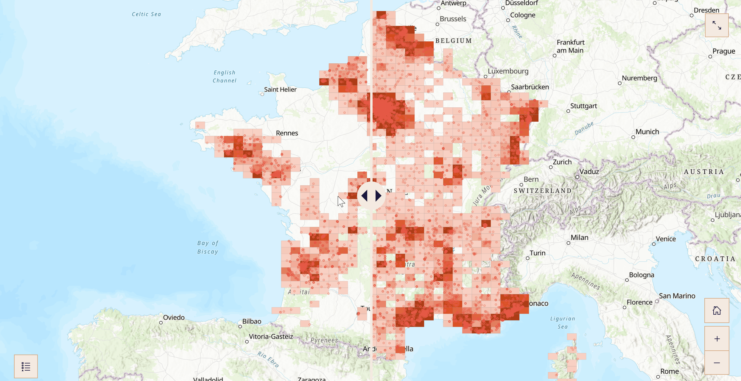
Before-and-after sliders: Demonstrating measurable impact with side-by-side comparisons of data or visuals. See an example with Solinum’s before and after map.
Tell compelling stories, showcase the importance of your work, and secure more funding.